

Written by Hannah Owen for ARTHIST 210: Modernism and Design at University of Auckland, taught by Linda Tyler, 2022.
Grade: A+
Graphic art at the Bauhaus.
A curation and critique of five objects and how well these objects achieved the goals of the Bauhaus.
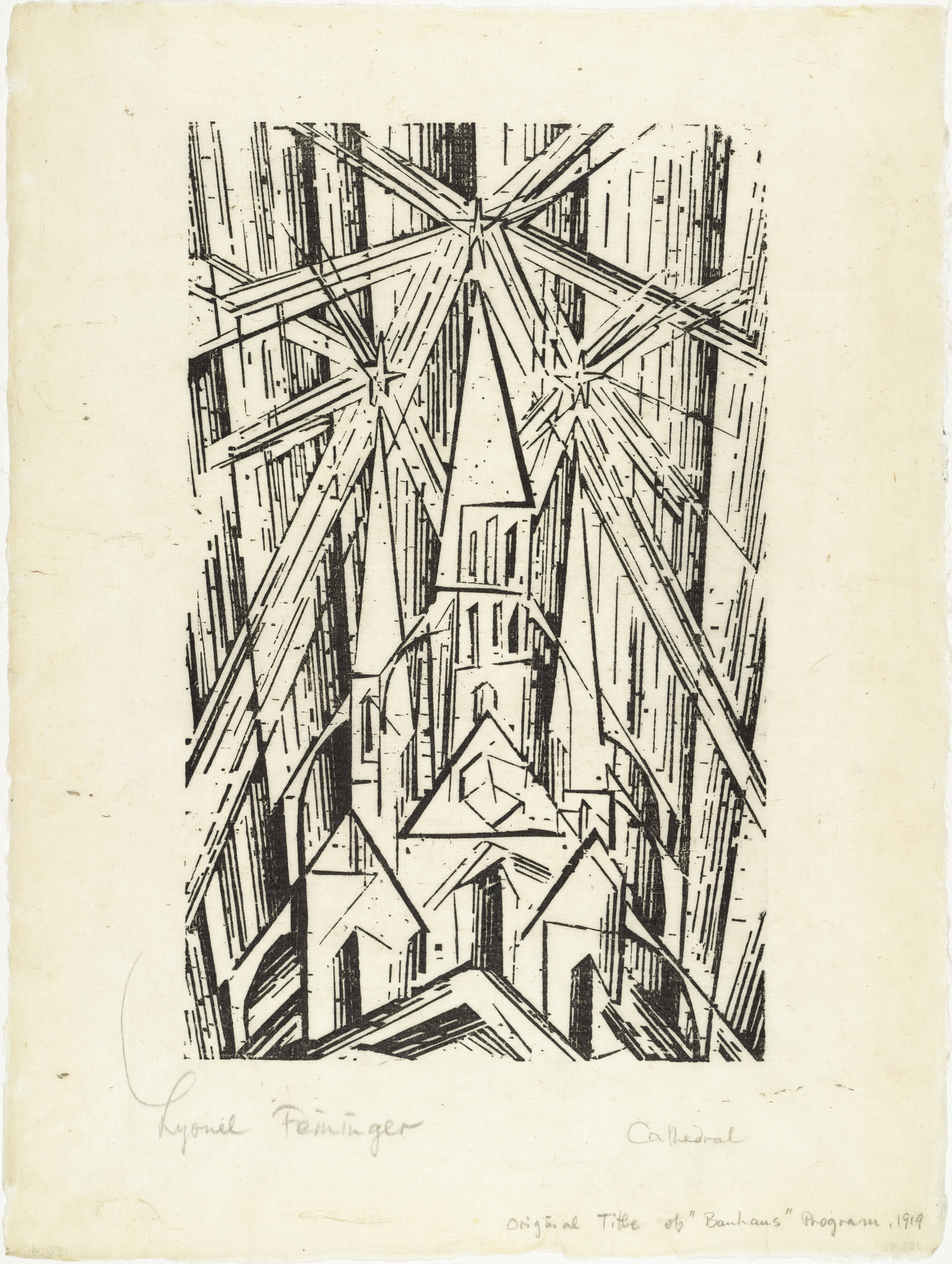
Figure 1: Feininger, Lyonel. 1919. Cathedral. Woodcut. Bauhaus Weimar, Germany.
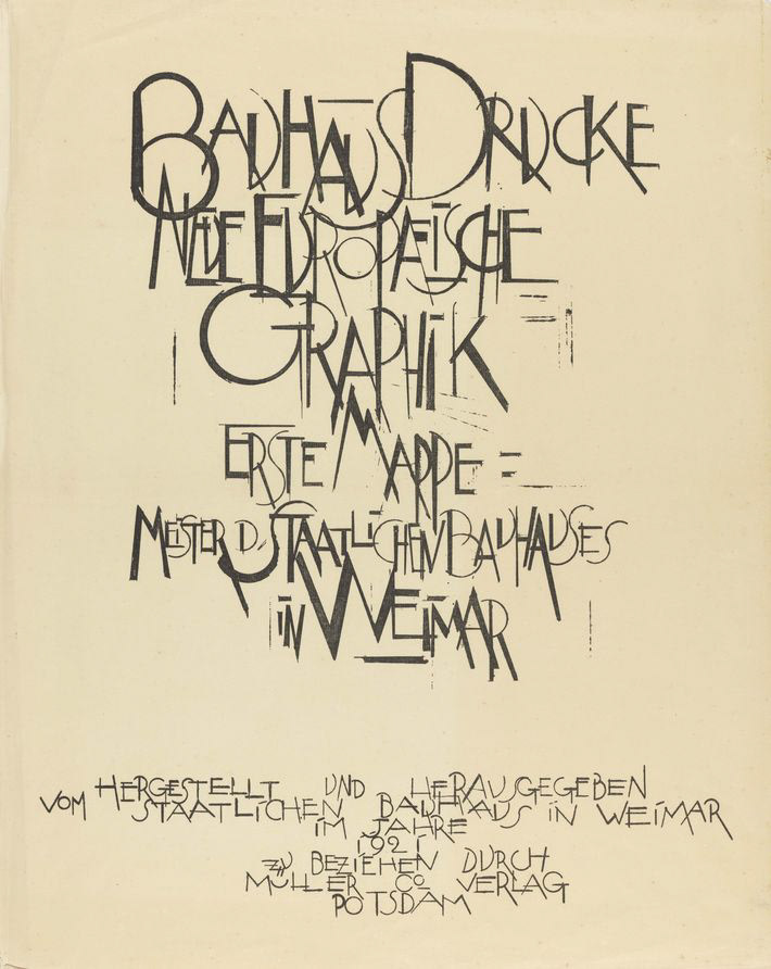
Figure 2: Feininger, Lyonel. 1921. Neue Europäische Graphik. Woodcut. Bauhaus Weimar, Germany.
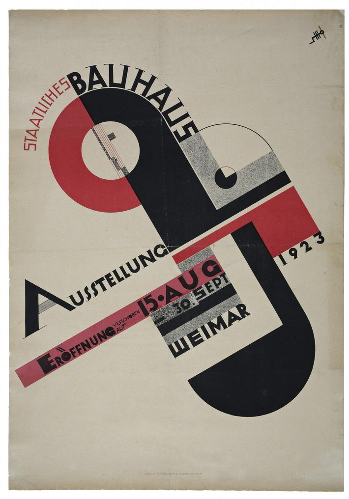
Figure 3: Schmidt, Joost. 1923. Staatliches Bauhaus Ausstellung. Lithograph. Bauhaus Weimar, Germany.
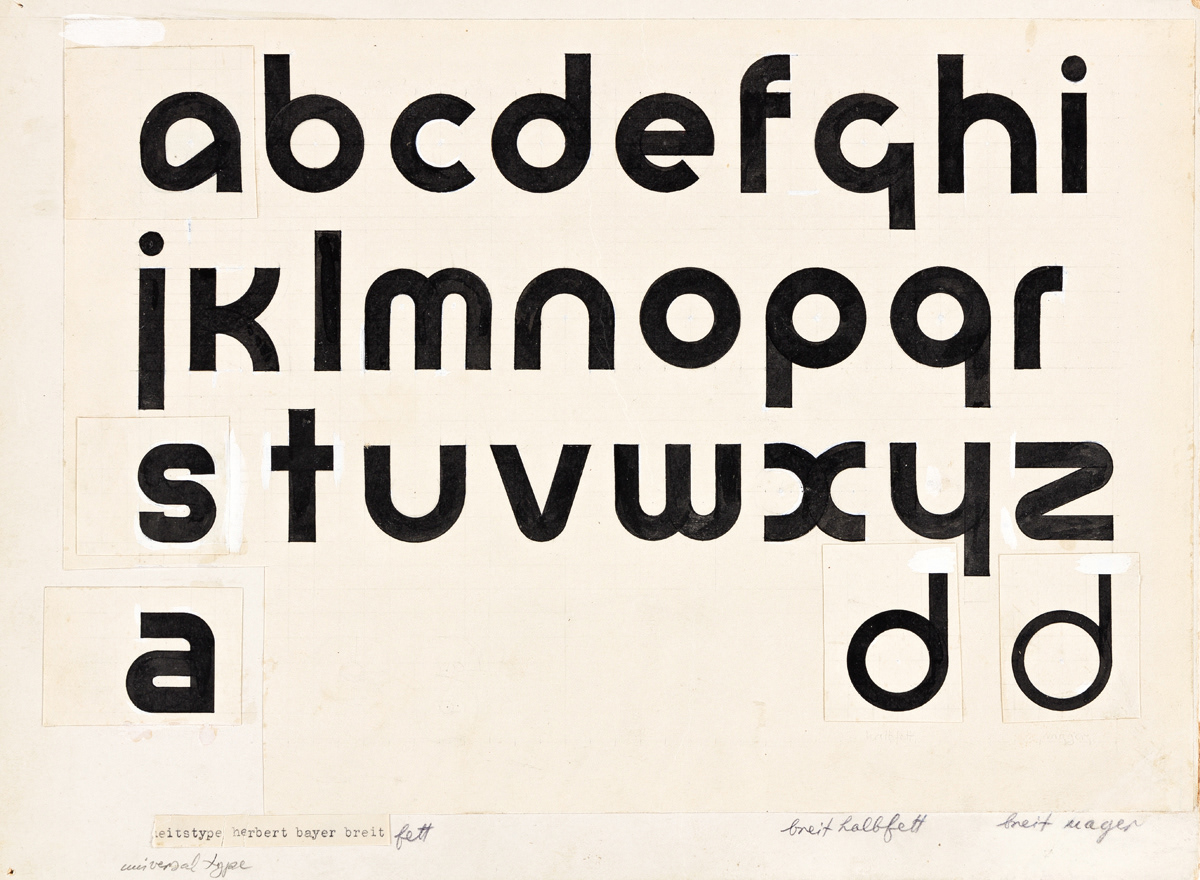
Figure 4: Bayer, Herbert. 1925, improved 1928. Universal Type. Ink, pencil, correction fluid on paper. Bauhaus Dessau, Germany.
Figure 5: Bayer, Herbert. 1925. Universal Type – Diagram of Letter Structure. Bauhaus Dessau, Germany.
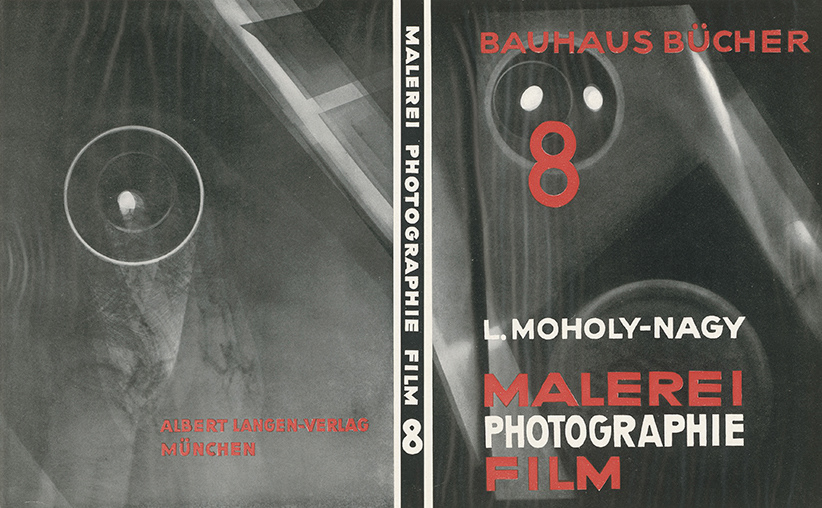
Figure 6: Moholy-Nagy, László. 1927. Bauhausbucher 8: Malerei, Photografie, Film. Photogram, letterpress, book. Bauhaus Dessau, Germany.
Post-World War I was a time of rapid social reform across Europe. Citizens looked toward a new way of living. A result was the Bauhaus, founded by German architect Walter Gropius in Weimar in 1919. Gropius had a radical vision of educating artists, designers, and artisans to reflect the new world.[1] The Bauhaus aimed to combine manufacturing and individuality and create work where function dictates form. Gropius believed that the Bauhaus should not impose a particular style, allowing students to express their individuality and experiment.[2] They viewed the artist and craftsman as one with disciplines ranging from printmaking to metalwork. There was a focus on modern materials with consideration to economy and simplicity. Its output needed to be affordable and functional before it was beautiful. The Bauhaus' primary goal was to create gesamtkunstwerk – the total work of art. This manifested in architectural design, with all disciplines able to come together to contribute to the whole. Architecture was not the only output of the Bauhaus. Graphic art[3] was also significantly developed within the Bauhaus period, allowing the discipline to embrace modernist ideals and aesthetics. This essay is a curation of five graphic art objects that demonstrate the evolution of and communicate Bauhaus ideology. Beginning in Weimar, I will compare Lyonel Feininger’s Cathedral, 1919, and Neue Europäische Graphik (New European Graphic) poster, 1921, and discuss Joost Schmidt’s Staatliches Bauhaus Ausstellung poster from 1923. I will then look at two revolutionary developments from Dessau: Herbert Bayer’s 1925 Universal Type, and László Moholy-Nagy’s 1927 edition of Bauhausbücher 8: Malerei, Photografie, Film.
In post-war Germany, artists sought to use a language of feeling, mood and atmosphere in their work to respond to the atrocities of conflict. Known as Expressionists, they hungered for a utopian world rooted in idealised visions of the past.[4] They used the concept of a 'crystal cathedral' as a metaphor for utopian ideals and spiritual transformation. This idea heavily influenced the early years of the Bauhaus through the teachings of Lyonel Feininger, master of the printmaking workshop. Workshops at the Bauhaus were structured and influenced by idealised medieval craft collectives working towards a common goal. In opening the Bauhaus, Gropius wrote a manifesto to promote the school's radical, modern thinking, and Feininger created the title page. Influenced by medieval woodblock prints, Cathedral, 1919 (fig. 1) portrayed the institution as a visionary building - a crystal cathedral. Through bold lines and celestial symbols, Feininger visualised the utopian collectivism that German people sought after and aligned these ideals with the words of Walter Gropius. Cathedral is an example of material and function dictating the form of the image. Timber was viewed as the material of utopia, and woodcut printing is a hand-carved method of printing that allows graphic images to be reproduced infinitely. Feininger was conscious of economy and ease of distribution for the manifesto while demonstrating the Bauhaus' early focus on showing the artist's hand. With Cathedral in mind, we can also look at Feininger's Neue Europäische Graphik (fig. 2), designed in 1921 for a collective portfolio of printed work. It features robust and spiked calligraphy and an over-emphasis of line. We can again see the artist's hand in this work, as Feininger does not use rulers or geometry. The words are expressive and seem to communicate the inflections of speech.[5] The lettering is elongated, overlapping, and uneven. The directional lines lead the eye into the composition, like the lines we see in Cathedral leading toward the stars. The visual similarities between Graphik and Cathedral are apparent, and we can observe both the utopian material of wood and expressionist influences in these early-Bauhaus works.
The Bauhaus had turned away from its eclectic Expressionist style by 1923. The curriculum moved towards functionalism and a machine-based aesthetic influenced by the Constructivist style. Oskar Schlemmer, a master at the Bauhaus, explained the shift in 1922: "Turning away from utopia! …Not cathedrals, but machines to live in."[6] Constructivist influence encouraged the concept of the artist as an engineer; man as a machine. Students of the Bauhaus were taught to use rulers and compasses instead of previously embraced free-hand techniques.[7] As a result of this change, the Bauhaus moved into geometric simplicity and the utilisation of technology of the modern age. The students and masters of the Bauhaus held an exhibition in 1923 to celebrate this post-Expressionist, functionalist identity of the Bauhaus. A student of the Bauhaus, Joost Schmidt, created a Constructivist-inspired poster (fig. 3) advertising the Staatliches Bauhaus Ausstellung. This poster is a direct reflection of the teaching style in 1923. The composition consists of a tight oval shape leaning diagonally, with all other elements responding to this shape using black and red as balance. The poster features an abstracted, linear face which is a logo designed by Schlemmer to represent the Bauhaus. This logo was created to be easily reproduced with printer rules,[8] part of the letterpress machine. In addition to using tools to create straight lines and smooth curves, using machinery to depict a face could be seen as a personification of 'man as machine'. There is little evidence of the artist's hand, but we can identify Schmidt's hand-printed typography. The line weights are not consistent; it gives a human touch to an otherwise mechanical and still graphic. The letterforms are heavy and geometric, and although they feature subtle serifs, this typography is an early step towards the standardisation of the sans-serif later seen in the Bauhaus.
Once the Bauhaus moved to Dessau in 1925, it had an established and recognised style: geometric, modern, and functional.[9] With all expressionist influence from the school and emphasis on the pure machine aesthetic prioritised, it was no longer necessary to see the artist's hand in their work. The Dessau Bauhaus collaborated heavily with industry and students designed with the intent to mass-produce.[10] Herbert Bayer was a Jungmeister, a 'young master', who completed the Bauhaus curriculum and led the workshops devoted to typography and advertising.[11] Bauhaus master, László Moholy-Nagy, had already standardised sans-serif at the school, adamant that "…all typography must emphasise clarity over any other element."[12] Recognising a need for typography that reflected the new Bauhaus style, in 1925, Bayer began the development of Universal Type (fig. 4). Universal was an entirely lowercase, sans-serif typeface designed for mass printing on a letterpress[13] to reflect the spirit of the machine age and to distance itself from archaic German blackletter. This was considered 'un-German' by right-wing conservatives as the German language uses uppercase at the beginning of nouns. The "rationalisation of writing and printing"[14] became symptomatic of "all that was wrong with the Bauhaus."[15] Lowercase lettering created a more efficient and economical way of printing. Usually, a letterpress machine requires at least two sets of alphabets to form a grammatically correct body of text. Bayer explains: "Why should we write and print with two alphabets? Both a large and small sign are not necessary to indicate a single sound."[16] Developing a singular alphabet halved the cost and time necessary to print a body of work. Bayer formed a grid using only a few arcs, three angles, and vertical and horizontal lines that would help him create a consistent and dynamic typeface (fig. 5). As a result, the rational, geometric forms are undoubtedly Bauhaus. From 1925 onwards, the Bauhaus abandoned capital letters and transitioned to lowercase almost exclusively.[17]
Furthering the interest in typography and printing and establishing photography workshops, László Moholy-Nagy was revolutionary in developing graphic arts at the Bauhaus. Although not trained as a photographer, Moholy-Nagy was incredibly knowledgeable on the subject due to his highly experimental creative output and research. Photography was a turning point in print design as it could replace the illustration as a means of mass representation[18] and was "…no longer a mere copy of nature."[19] Visual communication was modernised and mechanised using techniques such as photomontage and photogram. Understanding the importance of documenting the developments and teachings throughout the Bauhaus, Moholy-Nagy and Gropius edited a series of books – titled Bauhausbücher, the Bauhaus Books. There are fourteen volumes published in collaboration with the Albert Langen publishing house between 1925 and 1930. These books highlighted the masters' contributions to the Bauhaus from both Weimar and Dessau. Moholy-Nagy contributed his writing to the 8th volume published in 1927, titled Maleri, Fotografie, Film (Painting, Photography, Film) (fig. 6), in which he discussed his philosophies and experimental developments. He outlined photography as a new way of seeing: "…[a means to] make visible existences which cannot be perceived or taken in by the eye."[20] Of most significance, Moholy-Nagy coined the term 'typophoto'. He described this as "the visually most exact rendering of communication,"[21] using text and image to ensure clear communication. The cover of Maleri, Fotografie, Film (Painting, Photography, Film), with sans-serif capitals integrated into and overlaying a grey-toned photogram, is an example of this. An apparent reference to Constructivism, this photogram is an abstract geometric image, serving as a functional background for the typophoto and the primary visual element.[22] This aligns with the Bauhaus' continuing value that form follows function – the simplicity and clarity of the image emphasise the typography and, as a result, is a dynamic, three-dimensional photograph.
Over its twenty-four year duration, the Bauhaus was consistently rational, modern, and radical in its teachings and creative output. The school began with a focus on the artist's hand, with roots in Expressionism and its utopian ideals, as evidenced by Lyonel Feininger's Cathedral and Neue Europäische Graphik. It transitioned into Constructivism, where the emphasis was placed on geometry and man as machine, shown in Joost Schmidt's Staatliches Bauhaus Ausstellung poster. The move to Dessau established what we can now recognise as a coherent Bauhaus style where geometry, typography, and visual communication were refined, and emphasis was placed on production and industry collaboration. This culminated in both Herbert Bayer’s Universal Type and László Moholy-Nagy’s Bauhausbücher 8. These objects all demonstrate the goals of the Bauhaus and, as a result, helped explore and define what it meant to be modern in a time when so many were looking for a new way of living.
footnotes.
[1] Gropius, Walter. 1919. Program of the Staatliche Bauhaus in Weimar. Accessed April 2022. https://bauhausmanifesto.com/.
[2] Heller, Steven. 2018. Graphic Style: From Victorian to Hipster. 4th Edition. New York, New York: Abrams. p.144
[3] Graphic art is a term that can define work created on a two-dimensional surface, for example: graphic design, typography, and photography.
[4] Eskilson, Stephen. 2012. "The Bauhaus and the New Typography." In Graphic Design: A New History. New Haven, Connecticut: Yale University Press.
[5] Hollis, Richard. 2021. World of Art: Graphic Design in the Twentieth Century. Third Edition. London: Thames & Hudson. pp.52-55
[6] (Eskilson 2012)
[7] (Eskilson 2012)
[8] (Hollis 2021)
[9] (Heller 2018)
[10] Hughes, Robert. 1991. The Shock of the New. Updated and Enlarged Edition. London: Thames & Hudson. pp.195-96
[11] (Eskilson 2012)
[12] (Eskilson 2012)
[13] Universal Type was only developed as far as sketches. It first became a working typeface in 1997 when it was digitised by the P22 type foundry. I have used this typeface on the title page of this essay.
[14] Bayer, Herbert, Walter Gropius, and Ise Gropius. 1938. Bauhaus 1919-1928. New York: Museum of Modern Art New York. p.149
[15] (Eskilson 2012)
[16] (Bayer, Gropius and Gropius 1938)
[17] (Bayer, Gropius and Gropius 1938)
[18] (Hollis 2021)
[19] Moholy-Nagy, László. 1927. Malerei, Photografie, Film. Bauhausbücher 8. Translated by Janet Seligman. Dessau: Albert Langen.
[20] (Moholy-Nagy 1927)
[21] (Moholy-Nagy 1927)
[22] (Eskilson 2012)
Bibliography.
Ades, Dawn. 2021. World of Art: Photomontage. Third Edition. London: Thames & Hudson.
Bayer, Herbert, Walter Gropius, and Ise Gropius. 1938. Bauhaus 1919-1928. New York: Museum of Modern Art New York.
Eskilson, Stephen. 2012. "The Bauhaus and the New Typography." In Graphic Design: A New History. New Haven, Connecticut: Yale University Press.
Gropius, Walter. 1919. Program of the Staatliche Bauhaus in Weimar. Accessed April 2022. https://bauhausmanifesto.com/.
Heller, Steven. 2018. Graphic Style: From Victorian to Hipster. 4th Edition. New York, New York: Abrams.
Hollis, Richard. 2021. World of Art: Graphic Design in the Twentieth Century. Third Edition. London: Thames & Hudson.
Hughes, Robert. 1991. The Shock of the New. Updated and Enlarged Edition. London: Thames & Hudson.
Moholy-Nagy, László. 1927. Malerei, Photografie, Film. Bauhausbücher 8. Translated by Janet Seligman. Dessau: Albert Langen.
Image list.
Figure 1 – Feininger, Lyonel. 1919. Cathedral. Woodcut. Bauhaus Weimar, Germany.
Figure 2 – Feininger, Lyonel. 1921. Neue Europäische Graphik. Woodcut. Bauhaus Weimar, Germany.
Figure 3 – Schmidt, Joost. 1923. Staatliches Bauhaus Ausstellung. Lithograph. Bauhaus Weimar, Germany.
Figure 4 – Bayer, Herbert. 1925, improved 1928. Universal Type. Ink, pencil, correction fluid on paper. Bauhaus Dessau, Germany.
Figure 5 – Bayer, Herbert. 1925. Universal Type – Diagram of Letter Structure. Bauhaus Dessau, Germany. Source: Bayer, Herbert, Walter Gropius, and Ise Gropius. 1938. Bauhaus 1919-1928. New York: Museum of Modern Art New York.
Figure 6 – Moholy-Nagy, László. 1927. Bauhausbucher 8: Malerei, Photografie, Film. Photogram, letterpress, book. Bauhaus Dessau, Germany.